How to Create a Basketball Camp Logo That Will Score You Points
Contents
- What to consider when creating a Basketball Camp logo
- The importance of a strong and recognizable basketball camp logo
- How to make your Basketball Camp logo stand out from the competition
- Tips for creating an effective basketball camp logo
- The do’s and don’ts of creating a Basketball Camp logo
- How to use your Basketball Camp logo to market your camp
- The benefits of a well-signed basketball camp logo
- How to create a basketball camp logo on a budget
- The top 10 basketball camp logos of all time
- How to create a basketball camp logo that will score you points
Whether you’re starting a new Basketball Camp or just looking to update your current logo, making sure it’s eye-catching and memorable is key. Learn how to create a Basketball Camp logo that will score you points with your audience!
What to consider when creating a Basketball Camp logo
Creating a brand for your basketball camp is essential for marketing your program and building a loyal customer base. Your camp logo should be thoughtfully designed to reflect the values of your program and appeal to your target audience. Here are a few things to consider when creating a basketball camp logo that will score you points with parents and players alike.
Your logo should beSimple and easy to read – A busy or complicated logo will be difficult to reproduce on promotional materials and apparel. Keep it clean and easy to understand at a glance.
Memorable – A great camp logo will be one thatParents and players can easily remember and recall when they see it. A catchy tagline or slogan can help make your logo more memorable.
Appropriate – Be sure your logo is appropriate for the age group you are targeting. A cartoon character may appeal to younger players, while a more sophisticated design may be better suited for older players.
Unique – With so many basketball camps out there, it’s important that your camp’s branding sets you apart from the competition. A unique logo will help you stand out from the crowd and make a lasting impression on potential customers.
Professional – First impressions matter, so you want potential customers to see your camp as credible and professional. Avoid using Clip Art or inexpensive graphics in your logo design instead, invest in high-quality visuals that communicate the quality of your program.
Your Basketball Camp logo should be an important part of your overall branding strategy, so take the time to create a design that reflects the values of your program and resonates with your target audience. With careful planning and execution, you can score big points with parents and players alike!
The importance of a strong and recognizable basketball camp logo
A strong and recognizable Basketball Camp logo is important for a number of reasons. First, it can help you to attract attention from potential campers and their families. A well-designed logo can also make your camp look more professional and organized, which can give you a leg up on the competition. And finally, a great logo can help create a lasting impression on those who attend your camp, which could lead to repeat business or even word-of-mouth referrals.
If you’re not confident in your design skills, there’s no need to worry — there are plenty of resources available to help you create a Basketball Camp logo that will score you points. Here are a few tips to get you started:
1. Keep it simple. Your logo should be easy to understand at a glance. Too much detail will only confuse potential campers and their families, so stick to basic shapes and colors.
2. Make it memorable. A good logo should be eye-catching and unique. Use bright colors or bold fonts to help your camp’s logo stand out from the rest.
3. Use positive imagery. Basketball is an inherently positive activity, so be sure your logo reflects that by using happy images and uplifting messages.
4. Keep it relevant. Your basketball camp logo should be relevant to the type of camp you’re running. If you’re focused on teaching the basics of the game, for example, avoid using images that are too advanced or confusing for younger players.
54600-basket-ball-camp-logo
How to make your Basketball Camp logo stand out from the competition
Are you thinking about starting a basketball camp? A great first step is to create a logo that will make your camp stand out from the competition.
Here are a few tips to create a Basketball Camp logo that will score you points:
1. Keep it simple. A complex logo will be hard to reproduce on marketing materials and merchandise. Stick to one or two colors and make sure the text is easy to read.
2. Use recognizable imagery. A basketball or Hoop is a good choice, but try to avoid using generic clip art If you want your logo to be truly unique, consider hiring a graphic designer.
3. Make it memorable. A well-designed logo will stay in people’s minds long after they see it. Use strong visuals and an clever tagline to make sure your camp’s logo is unforgettable.
Tips for creating an effective basketball camp logo
Think about what you want your logo to communicate. A Basketball Camp logo should be visually appealing and reflect the theme or style of the camp. It is also important to keep in mind that the logo will be used on a variety of marketing materials, so it should be easy to reproduce in various sizes and formats.
Here are a few tips to keep in mind when designing your basketball camp logo:
1. Keep it simple – Use clean lines and avoid cluttered designs. The goal is to create a logo that is easy to read and recognize.
2. Use meaningful symbolism – Incorporate imagery that is associated with basketball or uniquely represents your camp.
3. choose colors wisely – Use colors that complement each other and are eye-catching without being overwhelming.
4. Make it legible – Remember that the logo will be used in a variety of print and digital media, so make sure it can be easily read at different sizes.
5. Avoid Trends – Choose a timeless design that will not quickly become dated or out-of-style.
The do’s and don’ts of creating a Basketball Camp logo
Whether you’re starting a basketball camp for kids or adults, having a logo is essential for marketing your program. A good logo will help you stand out from the competition and communicate what your camp is all about. But designing a logo can be tricky — you want it to be eye-catching and memorable, but also simple and easy to understand.
Here are some dos and don’ts to keep in mind as you design your Basketball Camp logo:
Do:
-Keep it simple. A complex logo will be hard to reproduce and won’t make a strong impression. Stick to one or two colors and a few basic shapes.
-Make it relevant. Your logo should convey what your basketball camp is all about. If you specialize in teaching Three-point shooting for example, consider incorporating a basketball into your design.
-Think about who will see it. Remember that your logo will be used on everything from your website to your t-shirts, so choose a design that can be easily adapted to different formats.
Don’t:
– try to do too much. A cluttered logo will be confusing and difficult to remember. Keep it clean and straightforward.
– copy other people’s designs. Not only is this plagiarism, but it could also get you into legal trouble if the original designer decides to take action. If you’re inspired by another logo, use it as a starting point for your own unique design.
– neglect the details. Make sure your logos are spelled correctly and that the colors are consistent across different mediums. These small details will make a big difference in how professional your business looks
How to use your Basketball Camp logo to market your camp
What comes to mind when you think of a basketball camp? If you’re like most people, you probably think of sweaty teenage boys running around a gymnasium, shooting hoops and trying to impress the coach. But what if there was more to it than that? What if your basketball camp could have a logo that would score you some serious points with potential campers and their parents?
Creating a basketball camp logo is easier than you might think, and it can be a great way to market your camp. Here are a few tips to help you create a logo that will score you some serious points:
1. Keep it simple. Your Basketball Camp logo should be easy to understand and remember. Avoid complex designs or images that are hard to replicate.
2. Use strong colors. Basketball is an energetic and exciting sport, so your logo should reflect that. Use strong, vibrant colors that will grab attention and make your camp logo stand out from the crowd.
3. Use action words. Choose words like “slam” or “dunk” that convey the excitement of the game. These words will help potential campers visualize what your camp is all about, and they’ll be more likely to remember your camp when it comes time to sign up.
4. Make it unique. With so many basketball camps out there, it’s important to make yours stand out from the crowd. A unique logo will help you do just that – so get creative!
5. Have fun with it! Remember, this is supposed to be represent your basketball camp – so have fun with it! Let your creativity shine through, and don’t be afraid to try something new
The benefits of a well-signed basketball camp logo
An intelligently designed basketball camp logo has many benefits. A great looking logo will make your camp look more professional and credible, which will help you attract more participants. A well-designed logo will also help create a visual identity for your camp that can be used on marketing materials, your website, and social media
A good basketball camp logo should be eye-catching and memorable, but it should also be simple enough that it can be easily reproduced in a variety of formats and sizes. And, of course, your logo should be relevant to your camp’s mission and values.
If you’re not sure where to start, check out some of the samples below for inspiration.
How to create a basketball camp logo on a budget
Are you looking to create a Basketball Camp logo, but don’t have a lot of money to spend? You’re in luck! With a little creativity and some free resources, you can create a logo that will score you points with your campers and their parents.
Here are some tips on how to create a basketball camp logo on a budget:
1. Use free resources: There are plenty of free online tools that you can use to create your logo. Canva is a great option for creating professional-looking designs without spending a dime.
2. Keep it simple: A complex logo will be more expensive to create and may be confusing for your campers. Stick to simple shapes and colors that can be easily reproduced.
3. Make it unique: Your basketball camp logo should reflect the unique aspects of your camp. Think about what makes your camp special and use that as inspiration for your design.
4. Get feedback: Once you’ve created a few drafts of your logo, ask for feedback from your target audience. Show it to potential campers and their parents and see what they think. Use their feedback to make revisions to your design until you have a final product that everyone loves.
The top 10 basketball camp logos of all time
A well-designed logo is a valuable asset for any business, but it’s especially important for Basketball Camps A great logo will help you attract campers and stand out from the competition.
Creating a Basketball Camp logo is a challenge, but it’s also an opportunity to be creative and have fun. To get started, think about what you want your logo to communicate. Are you looking to communicate tradition? A focus on fun? A commitment to excellence?
Once you have a clear idea of your camp’s identity, start brainstorming visual elements that will support your message. Do you want to use a basketball as your central image? Or something more abstract, like a net or hoop? What colors do you want to use? What font will you use for your camp’s name?
Once you have a few ideas, it’s time to start refining them. Consider how your different elements will work together and whether they convey the message you want to send. When you’re happy with your design, put it in front of some test audiences—friends, family, and other basketball enthusiasts—to get feedback. After making any necessary changes, you’ll be ready to roll out your new basketball camp logo!
How to create a basketball camp logo that will score you points
Your Basketball Camp logo is an important part of your marketing strategy. It’s how you’ll be remembered by your participants, and it’s how you’ll attract new ones. But what makes a great basketball camp logo?
Here are a few tips to create a Basketball Camp logo that will score you points:
1. Keep it simple. A complex logo will be difficult to remember and reproduce. Stick to one or two colors and make sure your text is easy to read.
2. Make it unique. Your logo should represent your camp’s personality and values. Avoid using generic Clipart or images that are too similar to other camp logos.
3. Use sharp, contrasting colors. Bright colors are eye-catching and will help your logo stand out from the competition. But be careful not to use colors that clash too much – you want your logo to be pleasing to look at, not jarring.
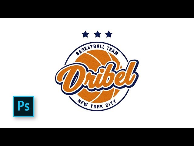
4. Consider incorporating an image related to basketball. A basket, ball, or player silhouette can make a great addition to your logo and help people remember what your camp is all about. Just make sure the image is appropriate for all ages – you don’t want to alienate potential participants with an overly-aggressive design!
5. Make sure your design looks good in both digital and print form. These days, people consume content in many different ways – on their computers, on their phones, and in print form. So it’s important that your logo can be reproduced in any format without losing its quality or impactful design
