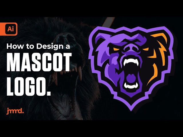
How To Design An Esports Logo?
Contents
Esports logos are more than just a name and some flashy graphics. If you want to design a professional esports logo, you need to understand the process and what goes into making a great one.
Do your research
Before you start designing your esports logo, it is important to do your research. This means finding out what other professional esports teams have done in terms of their logo design. Look at their color schemes, fonts, and overall aesthetic. What do you like about their logos? What don’t you like? Keep all of this in mind as you start to design your own logo.
Know your audience
Your research should start with your target audience. Find out everything you can about them. their age, location, gender, what games they like to play etc… All of these factors will help you determine the style, colors, and tone of your logo.
Researching your competition is also important. See what other logos in the industry look like and try to find a way to make yours stand out. Esports is a rapidly growing industry with a lot of competition. You need to make sure your logo is memorable and catches the eye.
Know your competition
No matter what business you’re in, you have competition. And in the world of esports, the competition is fierce. So, before you start designing your esports logo, it’s important to do your research and know who your competition is.
Think about the other teams in your league or tournament. What do their logos look like? How do they use color and shape to create a visual identity? What kind of message are they trying to communicate with their logo design?
Taking the time to research your competition will give you a better understanding of what works (and what doesn’t) in esports logo design. Armed with this knowledge, you can create a logo that stands out from the crowd and communicates the right message to your fans and sponsors.
Keep it simple
When it comes to creating an esports logo, less is more. You want your logo to be easy to remember, so avoid complex designs and illustrations. Stick to one or two colors, and use basic shapes and fonts. Keep it clean and eye-catching, and make sure it looks good at a small size.
Use 2-3 colors
There are a few things to consider when designing an Esports logo. First, you want to use 2-3 colors so that it is easy to reproduce and recognize. Second, you want to make sure the logo is simple and not too busy. Third, you want to use bold and easy to read fonts. And lastly, you want to make sure the logo looks good in both small and large sizes.
Use clean and easy to read fonts
Your esports logo will be seen by thousands of people, so you want to make sure it is easy to read. Stick to clean, sans-serif fonts such as Arial, Helvetica, or Verdana. These fonts are easy to read at a distance and will help ensure your logo is readable on everything from a t-shirt to a streaming banner.
Make it memorable
Your esports logo is one of the most important aspects of your team. It will be on your website, social media, t-shirts, and more. It needs to be memorable and easy to read. So how do you design an esports logo that will represent your team well?
Use a unique icon or symbol
Your esports logo doesn’t have to feature your whole team name or even just your initials. In fact, it’s often more effective to use a unique icon or symbol as your logo. This could be something abstract that represents your team name, or it could be a literal icon of something related to your team name. For example, if your team name is “The Eagles,” you could use an eagle icon in your logo.
If you decide to go with a unique icon or symbol, make sure it’s something that is easily recognizable and not too complex. You want people to be able to look at your logo and know immediately what it represents.
Use negative space
When it comes to design, less is often more. In the case of esports logos, that rings particularly true. The best ones make use of negative space — the blank areas around and between the logo’s subject matter — to create simple yet striking designs.
Take for example, Cloud9’s logo. The word “Cloud9” is written in white against a blue background. But it’s the space surrounding the word that makes the logo so effective. The designers left a small gap between the “9” and the edge of the logo, which gives the design a sense of balance and makes it more visually appealing.
Other well-known logos that use negative space include Nike’s “swoosh” and FedEx’s hidden arrow. So, when you’re designing your esports logo, don’t be afraid to experiment with empty space. A little can go a long way.
Hire a professional
There are a few ways you can go about trying to design your own eSports logo, but the simplest and most effective way is to just hire a professional. A lot of people try to take the DIY approach and either end up with a subpar logo or waste hours upon hours and still not be happy with the results.
A professional eSports logo designer will be able to create a custom logo that accurately reflects your team or organization. They’ll also be able to work with you to understand your vision and come up with creative ideas that you may not have thought of on your own. In the end, hiring a pro is really the only way to guarantee that you’ll end up with a high-quality eSports logo that you’re happy with.


