How to Create NBA Graphics that Stand Out
Contents
Creating NBA graphics that stand out can be a challenge. But with these tips, you can create amazing visuals that will grab attention and score big points with your audience.
Finding your inspiration
Inspiration is everywhere. And when it comes to NBA graphics, there are a few key places to look. Of course, you can always find inspiration in the work of other designers and artists. But you can also look to the world of fashion, music, and pop culture for ideas.
To get started, take a look at some of the following sources of inspiration:
-The NBA Store Here you’ll find a wide range of merchandise, including jerseys, hats, and other accessories. You can use these items as a starting point for your own designs.
-NBA TV: This channel offers up-to-date information on all things NBA including player profiles and highlights from recent games. watching NBA TV is a great way to get familiar with the league’s visual style and aesthetics.
--social media Following the official NBA accounts on Twitter and Instagram is a great way to stay up-to-date on the league’s latest graphics and designs. You can also search for the hashtag #NBADesign to see what others are creating.
Getting the right colors
In order to create graphics that stand out in the NBA, you need to carefully select your colors. The colors you choose should compliment each other and work well together. You also want to make sure that the colors you choose are appropriate for the message you are trying to communicate.
There are a few things to keep in mind when choosing colors for your NBA graphics. First, consider the color wheel. Second, think about how different colors make people feel. And third, take into account the team colors of the NBA teams you will be working with.
The color wheel can help you determine which colors will work well together. complementary colors are opposites on the color wheel and tend to create a more dynamic and eye-catching graphic. Analogous colors are next to each other on the color wheel and tend to create a more cohesive look. You can also use the color wheel to create various color schemes, such as monochromatic, triadic, or tetradic schemes.
When selecting colors, it is also important to think about how different colors make people feel. For example, warm colors like red and orange tend to be energizing, while cool colors like blue and green tend to be calming. Bright colors tend to be attention-grabbing, while subdued colors can be more relaxing. When creating graphics for the NBA, you want to choosecolors that will create the right mood or feeling for your message.
Finally, take into account the team colors of the NBA Teams you will be working with. You want to make sure that your graphics complement the team’s existing branding and color scheme For example, if you are creating graphics for the Boston Celtics you would want to use green and white as your primary Colors
Picking the perfect fonts
With so many teams and players in the NBA, it can be tough to make your graphics stand out. But with a little creativity and attention to detail, you can create some truly unique designs.
One way to set your work apart is to carefully select fonts that complement the theme of your design. For example, if you’re creating a graphic about the history of the NBA, you might want to use classic serif fonts like Bodoni or Garamond. Or if you’re making a poster for a specific team, you could use their official font (like the Los Angeles Lakers’ “Lakers” font) or another typeface that’s associated with the city they play in (like New York’s “Gotham” font).
Of course, you don’t need to limit yourself to traditional fonts—you can also get creative withdisplay or handwritten fonts. Just make sure whatever font you choose is legible at a glance, especially if you’re using it for something like a player’s name or stats.
Once you’ve selected the perfect font (or fonts), it’s time to start putting together your NBA graphic!
Adding some flair with shapes and patterns
In order to make your NBA graphics stand out, you’ll need to add some flair with shapes and patterns. One way to do this is to use unique shapes for each player’s head. For example, you could use a circle for Lebron James a square for Blake Griffin and a triangle for Kevin Durant You could also add patterns to their jerseys, such as stripes or polka dots. To really make your graphics pop, you could use bright colors and bold fonts.
Putting it all together
Now that we’ve looked at some individual elements that make up a great NBA graphic let’s put them all together and see how they work together. A well-designed NBA graphic has a few key elements that work together to create a visually appealing and informative final product.
First, an NBA Graphic should have a catchy headline that accurately reflects the content of the graphic. The headline should be attention-grabbing but not so over-the-top that it looks like clickbait. In addition to the headline, the graphic should have clear and concise supporting text that explains the main points of the graphic in more detail.
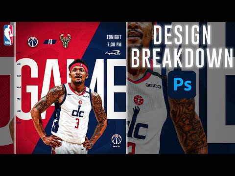
The next element is graphics. An NBA graphic should have high-quality images that are relevant to the topic at hand. These images can be photos, illustrations, or even gameplay footage, as long as they add something to the overall design. In addition to traditional image files, an NBA graphic may also contain charts or graphs if they help to illustrate a point more clearly.
Finally, an NBA graphic should be easy to read and understand. The overall design should be clean and organized, and the individual elements should be sized and positioned in such a way that they are easy to take in at a glance. By following these simple guidelines, you can Create an NBA graphic that is both eye-catching and informative.